Making a photobook is a creative endeavor, but there are also many small choices that can have an impact on the finished product. While working on a first book, it’s easy to get so focused on individual photographs that you lose sight of the whole book. Knowing what some of the common mistakes are will help you make better choices while your project is still at the editing stage.
1. Including Too Many Photographs
One of the most common mistakes is trying to fit everything in.
If you have a lot of photos in a book, the result may be that it feels like the book is repeating itself. When multiple photographs show the same idea, it’s generally best to leave out some of them, rather than include all of them.
Instead of trying to include everything, think about which single photo shows the idea best, and make sure you have room for it in the book.
2. Choosing Photographs Individually
A photo can be really good by itself but not work as well in a photobook.
While editing your book, try not to think of each photo on its own. Think about what happens when the photos are next to each other.
Notice the similarities and differences in terms of color, subject matter, composition, mood, etc. The aim should be to produce a book where the photos feel connected to each other, not just a showcase of great photos.
3. Ignoring the Sequence
The order of the photos influences how the reader perceives the book.
Having several high-impact photos in a row might make the book feel exhausting. Conversely, having too many low-impact photos in a row can make the book feel boring.
Play around with changes in scale, subject matter, color, and visual impact in order to create a better sense of flow.
4. Overdesigning the Pages
It’s easy to want to vary the layouts in the book, add different decorative elements, use a lot of different fonts, or change the number of columns per page.
But design should enhance the photos, not distract from them.
A single great photo on a page can often be more striking than a complicated layout with several different types of content.
Find a handful of basic design rules to follow and stick with them.
5. Forgetting About the Gutter
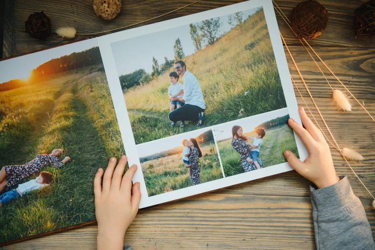
If a photo crosses the middle of a spread, part of the photo could end up getting lost in the binding.
This is a big problem if the gutter happens to cut across a face or an important object.
Be careful with full-page spreads, and avoid putting critical information near the center of a spread when you can.
6. Choosing the Format Too Quickly
The format of a book should be determined by the photos in it.
Picking a format because it’s appealing could lead to trouble later. Some pictures might need to be cropped too much, while some will become too small to look at. Test out a few different formats on some sample spreads before committing.
7. Relying Only on the Screen
A photobook is a physical object, and if you view your work only on a computer screen, you might overlook some issues. A spread that looks fine on screen might look totally different in print. Pictures might feel too small, page turns might seem clunky, and the paper might affect how colors and contrast look. Whenever possible, print out a rough dummy copy.
8. Leaving the Cover for Last
Often the cover is treated as an afterthought, but it’s what the reader sees first. The cover sets the tone for the book without necessarily showing everything inside. Decide whether your book needs an image, type, a title, or something more. Whatever you decide, it should fit the overall style of the book.
Edit First, Then Design
One good way to avoid these problems is to edit your photos before you think about design. Make sure you have the best photographs and the right sequence. Then, once you know what works, start planning your layouts, typefaces, and images. That way, you won’t feel attached to a layout just because you’ve already spent time working on it.
Think Like a Reader
When your first draft is ready, stop thinking like the photographer who took the pictures. Pretend you’re seeing the book for the first time. Look for things like:
- Does the beginning grab attention?
- Is the flow easy to follow?
- Are there any photos that don’t belong?
- Does the pace change?
- Are any key photos too small?
- Does the end feel finished?
It’s easy to miss things when you’re too close to your own work.
Conclusion
A good photobook comes together through many careful choices. Great pictures are essential, but editing, ordering, layout, format, and printing also affect the final result. You don’t have to avoid all of these pitfalls right away. Try things out and see what happens.
Review your work at different points and be ready to make changes when needed. A well-made photobook is not just a set of photos, it is a carefully curated visual story, and every picture and page should have its place.