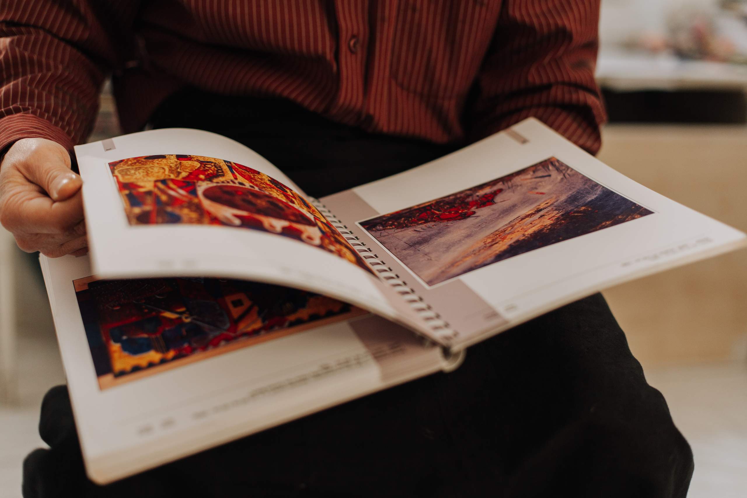
The format of a photobook is much more than a matter of size. It dictates how the photos are presented, how the pages turn, and what the overall experience is like.
When preparing a book for print, it’s worthwhile to take some time to think about its size, shape, paper type and binding. Make decisions that complement the photographs and don’t distract from them.
Begin with your photographs
Your photos can guide you towards a good format choice.
If you have a lot of landscape images, a horizontal book might allow them more room to breathe. Images that are predominantly portrait can easily be used in a vertical book. A square book may be a good choice if you plan to use photos in both portrait and landscape format.
Go through your images and determine the main image format before settling on a specific book format.
Decide on the shape
You can choose between three shapes:
Portrait
This format is great for portrait photography, architecture, fashion, or photos with a strong vertical composition.
It can also lend a classic editorial look, and single portrait photos can flow easily.
Landscape
Landscape books allow the photos to have more width, and are ideal for landscape photography, travel, interiors, and documentary photo books.
Panoramic photos can also be used without as much cropping.
Square
Square books have a nice symmetry, and can be a good choice if your book includes both portrait and landscape photos.
The consistent proportions of a square book can create a unique flow from page to page.
Think about the size
A large book makes the photos feel more substantial, but it doesn’t always follow that the larger the better.
A large book can be very impressive if your photos are meant to be appreciated in detail. However, smaller books may feel more personal and are generally easier to handle.
Consider how you want the user to engage with the book.
Are your images meant to be appreciated with plenty of room? Would a smaller book give a better experience?
Consider the layout
The size of the book should work in harmony with the layout.
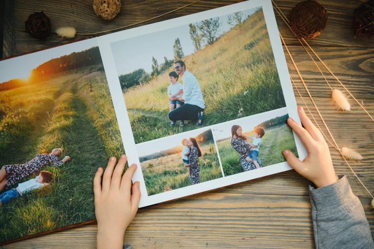
The photo could take up the full page, half a page, be placed next to another photo, or sit on a large expanse of white space.
Before deciding on the final format, try out a few layouts.
This way you’ll know how much space the photos actually need and whether you’re losing any important detail because they’re too small.
Choose your paper carefully
Paper plays a big role in the look and feel of a photobook.
Matte paper can give a less shiny appearance and may suit a subtle, or editorial, style of book. Glossy paper offers better contrast and makes colors appear more vibrant. However, depending on the lighting, glossy paper can be harder to view.
On the other hand, uncoated paper has a more tactile feel and can appear more natural. This may be a good choice if you’re making an art or documentary photobook.
There’s no “right” answer here. Pick a paper that best fits the look of your photos.
Don’t Overlook the Binding
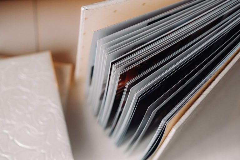
How the book is bound affects how the book opens and how images are displayed on the pages.
For many small photobooks, a standard perfect binding will work fine. A hardcover binding may make the book seem sturdier, while a lay-flat binding is great if your images span multiple pages.
Think about how the reader will hold the book as they flip through it, rather than just how it looks closed.
Watch Out for the Gutter
The gutter is the crease where two pages join.
If your photo has an important element right next to the gutter, that part of the image might get lost. This can be especially problematic if you’re using full-page images or double-page spreads.
Whenever possible, keep your primary subject and important details out of the gutter.
Make a Test Print
Before sending your photobook off to the printer, consider creating a test version of the book.
This doesn’t have to be a high-quality print, and you don’t even need to use the paper or binding that you’ve selected. A simple printout can help you identify issues that aren’t visible on a screen.
Some things you’ll want to check include:
- If the photos are big enough
- How the images look when laid out as spreads
- If there’s a comfortable pace in the sequence of images
- How the book feels in your hand
- If the gutter obscures any important parts of the photos
It’s far easier to make changes now than it will be once you send your photobook out for professional printing.
Design the Book for a Physical Format
Because the reader interacts with the book physically, the design of a photobook isn’t the same as a web-based gallery.
Factors like page size, paper type, binding style, weight, and how the book opens all play a role in how the images are perceived. Rather than deciding on a format first and then trying to fit your images into that format, begin with the personality of the project, and let it inform your decisions.
Summary
The best photobook layout will enhance the photos and the story you’re telling with them.
Make sure to take the orientation of your images, your intended reading experience, page sizes, paper, and binding into consideration before you finalize your photobook layout. Above all, make sure to physically evaluate your work before sending it off for printing.
A well-conceived photobook design should feel purposeful not only when you’re looking at it on a screen, but also when someone is holding it in their hands.